
Outlook does not usually destroy an email all at once. More often, it quietly removes the thing a layout was relying on: a gap between actions, the width that held a section together, the padding that made a button usable, or the contrast that separated content from its background.
The practical point of Outlook-safe email CSS is not to ban every modern property. It is to make sure the structure that carries the message still works when a property is reduced, ignored, or handled differently by an Outlook experience.
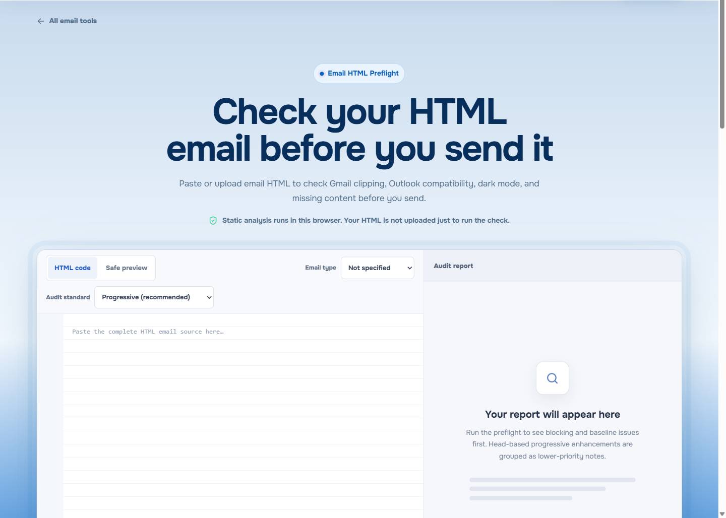
Run EasyAImail Email HTML Preflight before you send, then use a real inbox test for the clients your recipients use.
Rank CSS by what it is carrying
Start by separating the baseline from the enhancement. The baseline is the readable heading, supporting text, factual details, and primary action. An enhancement is a rounded corner, a shadow, a subtle background treatment, or finely tuned alignment.
If a property carries the baseline, it deserves a fallback. If it only improves the finish, a warning may be acceptable after review. That distinction is more useful than a long list of properties marked "yes" or "no."
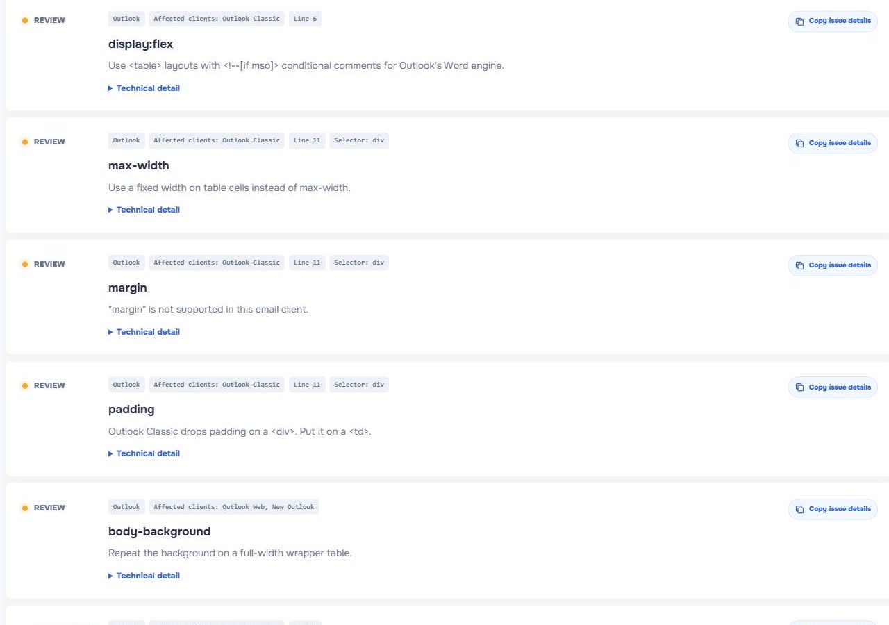
In the visible checker result, display:flex, max-width, and padding appeared as Outlook review items. The same report also shows other signals, but those three illustrate why a small CSS choice can affect the whole reading path.
Replace layout responsibility before removing modern CSS
display:flex and grid are comfortable ways to arrange content in a browser. In an email, do not let them be the only reason a two-column offer, status card, or button row has a predictable order.
When the order and spacing matter, give that responsibility to a simple presentation table. It is not about imitating a web page with older markup. It is about making a readable arrangement survive a less capable rendering path.
<table role="presentation" width="100%" cellspacing="0" cellpadding="0" border="0">
  <tr>
    <td style="padding:24px; background:#ffffff; border:1px solid #d7dde5;">
      <h2 style="margin:0 0 12px; font-size:22px; line-height:30px; color:#172033;">
        Project update
      </h2>
      <p style="margin:0; font-size:16px; line-height:24px; color:#334155;">
        The revised files are ready for your review.
      </p>
    </td>
  </tr>
</table>
The table is a stable container. Visual refinements can sit around it, but the recipient can still understand the message if those refinements disappear.
Put important spacing on a durable element
gap, margin, and padding can look interchangeable in a browser. In email, their behavior depends on the client and the element. Critical spacing should not be a lucky side effect of one modern layout rule.
If padding makes a primary button tappable, put it on the cell or structure you have tested. If a heading must be associated with the next paragraph, leave clear structural separation rather than trusting a fragile outer margin. If two actions must not run together, give each a clear container.
The aim is not extra whitespace. It is to preserve the reader's ability to see what belongs together and what they should do.
Treat width as a reading decision
max-width is helpful in a browser preview, but it may not control the message as expected in every email client. Set a sensible explicit width on the table or cell that needs it, and make sure the content remains coherent when a client chooses a different available width.
Avoid fixed-width assumptions that turn a small screen into horizontal scrolling. Long URLs, wide images, and a single unbreakable line can undo an otherwise safe structure. Test the content, not only an empty template.
Keep decorative CSS out of the critical path
Rounded corners, shadows, and polished background effects are often safe to treat as progressive decoration. A card can still be a card without a shadow. A button can still be a clear action without a perfectly rounded edge.
The problem begins when the decorative treatment is doing functional work. A pale button that is recognizable only because of a shadow, or white text that is readable only over a body-level background, is fragile. Move the essential contrast and meaning into the content container itself.
For the broader browser-to-inbox explanation, read Outlook HTML Email CSS Support.
Do not confuse Outlook Classic with every Outlook
Outlook is not a single rendering environment. A result in one Outlook experience is evidence about that target, not a universal answer for every desktop, web, or mobile configuration.
That is why a report should guide your triage rather than become a substitute for testing. Fix the code that affects hierarchy, action, and contrast first. Then send a representative test to the actual client mix when the email has meaningful consequences.
Inline the baseline without flattening everything
Inline declarations can make a baseline more durable, but they do not make client differences disappear. Responsive rules, dark-mode handling, and client-specific fallbacks may need to remain outside a simple style attribute.
Email CSS Inliner: How to Inline CSS Without Breaking Responsive Email walks through that tradeoff. A good conversion strengthens the ordinary state without discarding the code that lets the message adapt.
Use the report as a focused review list
EasyAImail Email HTML Preflight surfaces compatibility risks from the supplied HTML alongside content checks such as unresolved variables, links, images, and contrast. It is static analysis in the browser. It does not claim to reproduce every account, operating system, or future client update.
That limit is useful to remember: the report can point you to the fragile code before you guess. It cannot make a pixel-perfect promise for an inbox it has not actually rendered in.
FAQ
Does Outlook support flexbox in HTML email?
Do not let flexbox be the only structure that preserves essential order, spacing, or columns for an Outlook audience. Use a readable fallback where the layout carries the message.
Should I remove every property the checker flags?
No. Start with properties that affect readability, action, order, or contrast. A purely decorative effect can be an acceptable enhancement after you review the baseline.
Is a browser preview enough to approve an Outlook email?
No. It proves the intended browser view, not every inbox behavior. Combine a static report with a real test for the recipients and clients that matter.
Can I use CSS in the head for HTML email?
Yes, but do not assume it will be handled like ordinary browser CSS in every client. Keep a resilient inline or structural baseline for the parts recipients must understand.
Fix the part that carries the message
Treat the report as a starting point for triage, not a rendering guarantee. Protect the hierarchy, the action, and the contrast first; keep modern polish where it remains optional; then verify the final email in the inboxes that matter.
 Get the Edge extension
 Get the Firefox extension