
An email can look balanced in a browser preview and still come apart in Outlook. The usual symptom is not a dramatic crash. It is a quiet failure: spacing disappears, a two-column section stacks badly, a rounded card becomes flat, or a button loses its shape.
The useful response is not to memorize a giant compatibility table. It is to identify whether a CSS choice carries the core meaning of the email, then replace that choice with a safer baseline when it does.
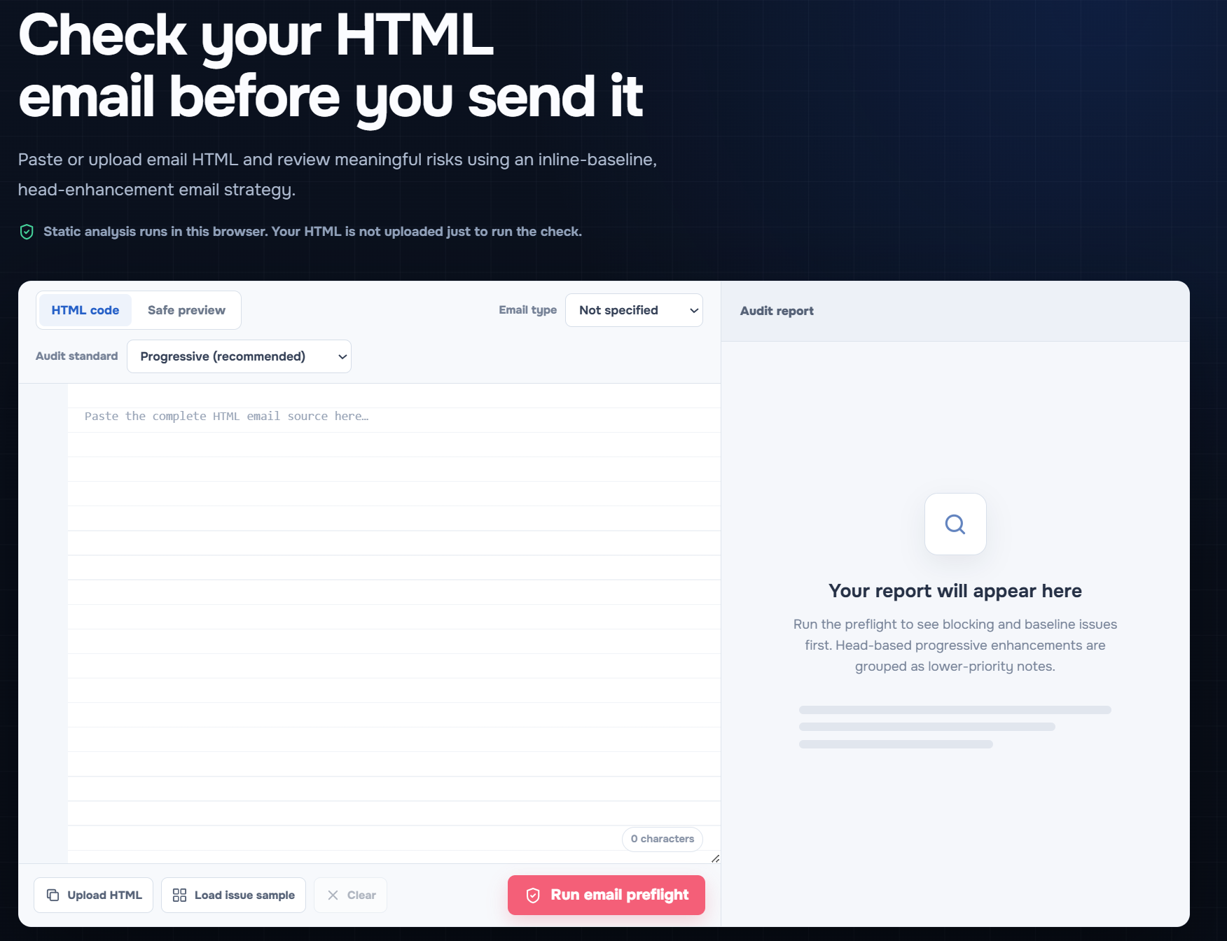
Open the free EasyAImail Email HTML Preflight to paste or upload your final HTML and review the report in your browser.
Why Outlook needs its own check
Outlook is not one rendering environment. Classic Outlook and newer Outlook experiences do not behave in the same way, and neither behaves exactly like a web browser. That is why "it works in Chrome" is not a useful test result for a message going to a mixed client list.
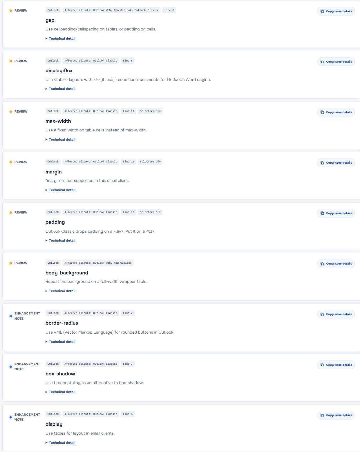
The EasyAImail checker separates client scores and groups Outlook-related findings so you can see where a modern layout may lose its baseline structure. The screenshot above shows issues around gap, display:flex, max-width, margin, padding, body-background, border-radius, and box-shadow.
Those properties are not equally serious. A missing shadow is a visual compromise. A broken column layout can hide the order of information or make a button hard to find.
Separate baseline layout from enhancement
This is the simplest way to make Outlook decisions.
The baseline is what a recipient needs to understand the email: a readable heading, body copy, the primary action, important date or price information, and a link that still works.
An enhancement is useful but nonessential: a soft shadow, a decorative gradient, a larger rounded corner, or a finely tuned responsive effect.
If a property only supports an enhancement, a warning may be acceptable after review. If it controls the baseline, rewrite that part before sending.
CSS patterns that deserve a closer look
Flexbox and CSS grid
Modern browser layouts often use display:flex or grid to align columns and distribute spacing. In email, a simple table structure is usually the safer baseline for content that must remain side by side or maintain a predictable order.
Do not use a table merely because it is traditional. Use one when the table is carrying actual layout responsibility that a less capable client may otherwise drop.
gap, margin, and padding
Spacing looks harmless until it is the only separation between two actions or between a heading and the text it belongs to. The issue sample flags gap, margin, and padding because a client may handle them differently depending on the element and context.
Put critical spacing on the structure you know will survive. If the layout is a table, test the padding on the relevant cell. Do not rely on a browser-only arrangement to make the email readable.
max-width
max-width can make a browser preview feel neat, but an email client may ignore it or interpret it differently. Use explicit widths and a layout that remains sensible when a client chooses a different width than expected.
Rounded corners and shadows
border-radius and box-shadow usually belong in the enhancement category. Keep them when they improve the design, but make sure the button or card still reads as an action or a content group without them.
Body backgrounds
Background treatment is often fragile. If the background carries contrast or hides a white button against a white page, the email has a baseline problem. Put essential contrast on the content container, not only on a body-level effect.
A safer replacement pattern
Suppose a modern web component uses a flex row, gap spacing, a shadow, and a rounded card. In an email, translate the job rather than copying every property.
        Project update


        The revised files are ready for your review.
It is less elegant than a web component on paper, but it protects the content hierarchy. You can add visual enhancements around it after the baseline reads correctly.
Use a report as a triage list, not an automatic rewrite
EasyAImail Email HTML Preflight has a progressive mode and a strict compatibility mode. Progressive mode is useful when you want to preserve a solid baseline while treating head-based visual enhancements as lower priority. Strict mode is for teams that need to reduce more of those differences before a campaign goes out.
Neither mode should make every warning feel identical. Review the affected section in the safe preview. Ask whether a recipient can still read the information, understand the action, and use the link without the flagged property.
What static analysis cannot promise
The checker does not send an email to every Outlook version, every operating system, and every recipient configuration. It cannot guarantee pixel-identical rendering or predict inbox placement.
What it can do is make risky code visible before you send, especially when a visually small CSS choice is holding up the actual layout. For a campaign with important revenue, account, or deadline consequences, use the report first and then send a real test to the inboxes your audience uses.
Related checks that are easy to miss
Outlook layout is only one side of preflight. A message can render acceptably and still fail because an image has no alt text, a button points to #, or a merge tag reaches a recipient unchanged. The checker puts those content and accessibility issues in the same report so layout work does not distract from what the reader actually receives.
For a broader explanation of browser-to-inbox differences, read Why Email Breaks in Outlook: From Browser Preview to Inbox.
FAQ
Does new Outlook support the same CSS as Outlook Classic?
Do not assume so. Treat them as separate client targets and look at the report's client-specific signals. A safer baseline matters more than winning a perfect match in one preview.
Should I remove every flagged CSS property?
No. Fix the properties that could break readability, content order, contrast, or the primary action first. A decorative shadow or rounded corner may be acceptable as a progressive enhancement.
Can I use flexbox in HTML email?
You can use modern CSS as an enhancement when the email still has a readable fallback. Do not make the core content order or essential spacing depend on it for a mixed Outlook audience.
Does a browser preview prove the email is Outlook-safe?
No. A browser preview is helpful for checking your intended layout, but Outlook has separate rendering behavior. Use static findings and a real inbox test for important sends.
Fix the part that carries the message
Before rebuilding an entire template, find the CSS that controls the message's hierarchy, spacing, action, and contrast. Run the HTML through the EasyAImail Email HTML Preflight, fix the baseline risks first, and let the decorative details remain optional.
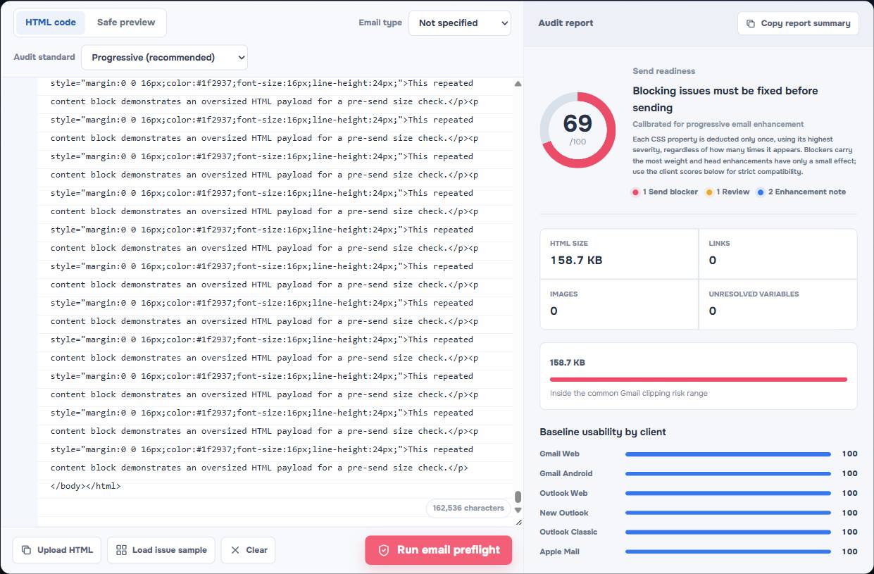
Gmail Clipping at 102 KB: What Counts Toward the Limit and How to Avoid It
Learn what counts toward Gmail's common 102 KB clipping risk, how HTML email source grows, and practical ways to reduce it without breaking the layout.
Read more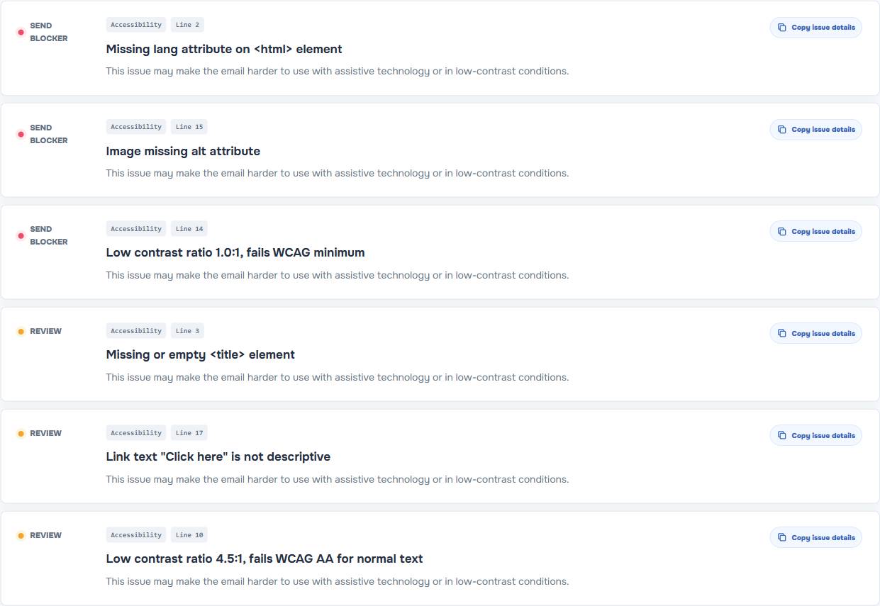
Email Dark Mode Testing: What to Check Before You Send
A practical email dark mode testing guide for Gmail, Outlook, and other inboxes: contrast risks, color changes, and pre-send checks.
Read moreHTML Email Accessibility Checklist: Alt Text, Contrast, Links, and Variables
Use this HTML email accessibility checklist to improve alt text, link wording, contrast, and unresolved variables before you send.
Read more