
Email dark mode is not one setting you can switch on and forget. A message that looks calm and readable in your editor can arrive with changed backgrounds, changed text colors, a nearly invisible logo, or a button that no longer looks clickable.
The practical goal is not forcing every client to display the same pixels. It is making sure the recipient can still understand the message and take the next step after a client changes colors.
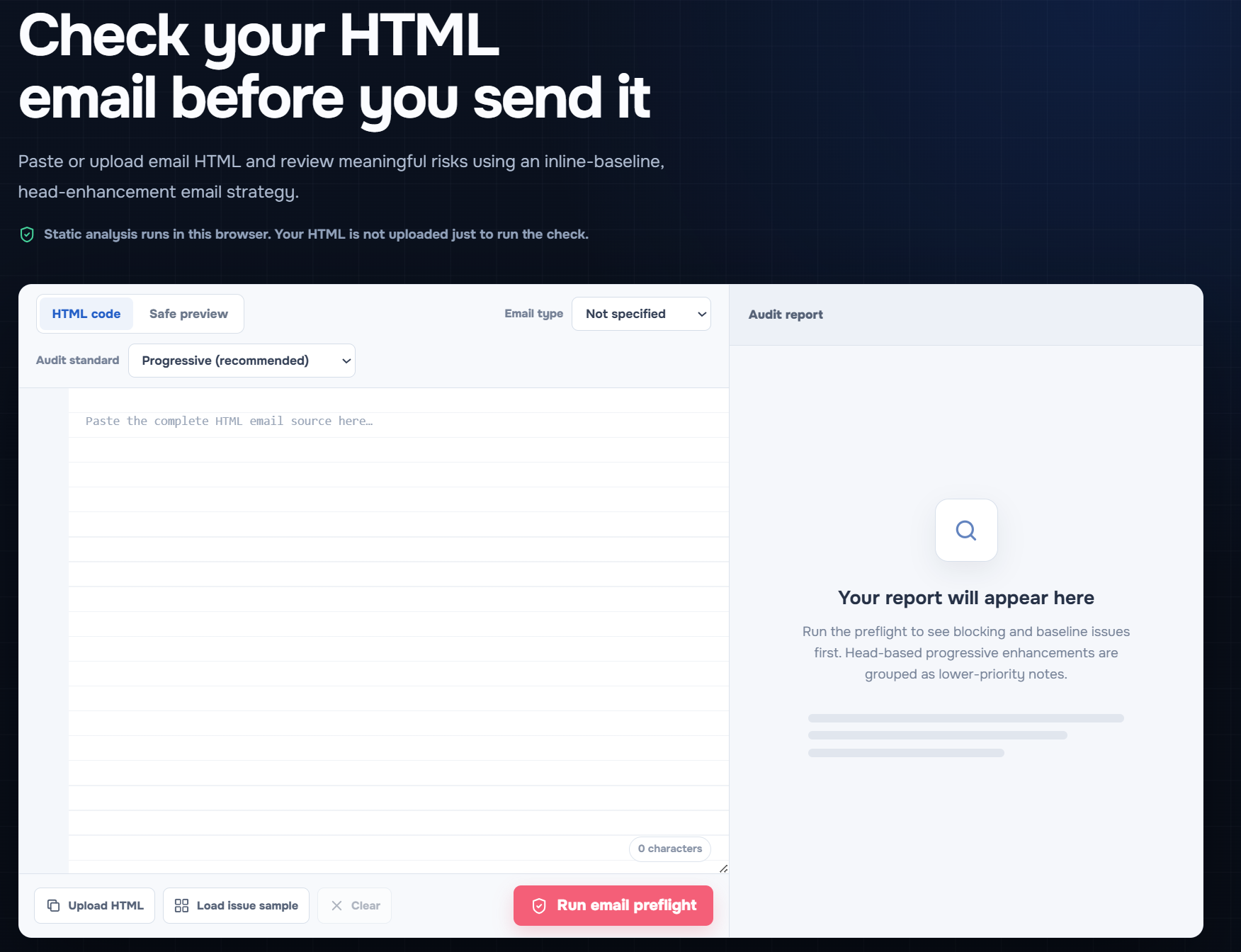
Open the free EasyAImail Email HTML Preflight to paste or upload your final HTML and review the report in your browser.
Why dark mode changes email design
Some email clients respect parts of the color choices in your HTML. Others transform colors more aggressively. The same code can therefore produce different results in Gmail, Outlook, Apple Mail, and browser-based inboxes.
That is why a dark-mode review should begin with meaning, not brand decoration. Can the recipient read the headline? Is the primary button still distinct? Does a logo disappear against the background? Does a warning or status depend on red versus green alone?
Check contrast before you check aesthetics
Low contrast is difficult in any theme and becomes worse when a client alters a background or foreground color. The checker surfaces contrast problems alongside other send blockers because faint text is not a cosmetic defect when it hides a date, price, or action.
For the message's core content, use a contrast relationship that remains obvious without relying on a subtle background tint. Keep body text, buttons, and important labels readable when viewed on their own.
If a light gray line is the only thing separating sections, give the content more structural separation too: spacing, a heading, or a clear border that does not depend on one color treatment.
Do not rely on color alone
Dark mode often reveals a problem that was already present: a message uses color as the only signal.
Instead of a green line that means "approved," write "Approved" in text. Instead of a red badge that means "action required," use a clear label and a specific request. Instead of a pale gray button that looks active only because of surrounding color, use descriptive button text and sufficient contrast.
This improves the email for dark mode, for low-quality screens, and for people who do not perceive color in the same way.
Treat logos and icons as content, not wallpaper
A logo with a transparent background can vanish when the inbox changes the surrounding color. A white icon inside a transparent button can disappear for the same reason.
Give critical marks a reliable background or a version that remains visible in different themes. If the image itself conveys important information, provide appropriate alt text. If it is purely decorative, empty alt text is often better than repeating noise to a screen reader.
The relevant question is not whether the brand mark looks perfect in every client. It is whether the recipient can still identify the sender and understand any information the image carries.
Make the primary action survive a theme change
An email can contain ten decorative details and one essential action. That action needs the most protection.
Check that the button label explains what happens next. Use a visible text link nearby when the action is high stakes. Keep the action's contrast separate from the page background. Avoid relying only on a background image or subtle shadow to make it look interactive.
For example, "Review the revised proposal" remains understandable if a button loses its rounded corners. "Click here" does not become clearer when a client changes the color around it.
What to test in a dark-mode preflight
Before you send, review these parts in order:
- Body text and headings: Can you read the important words at normal zoom?
- Buttons and links: Are they obvious, and does the label make sense out of context?
- Logos and icons: Do they disappear or lose meaning on a changed background?
- Status messages: Does text explain the status without depending on color?
- Images and fallback: Does the message still make sense when an image is blocked or transformed?
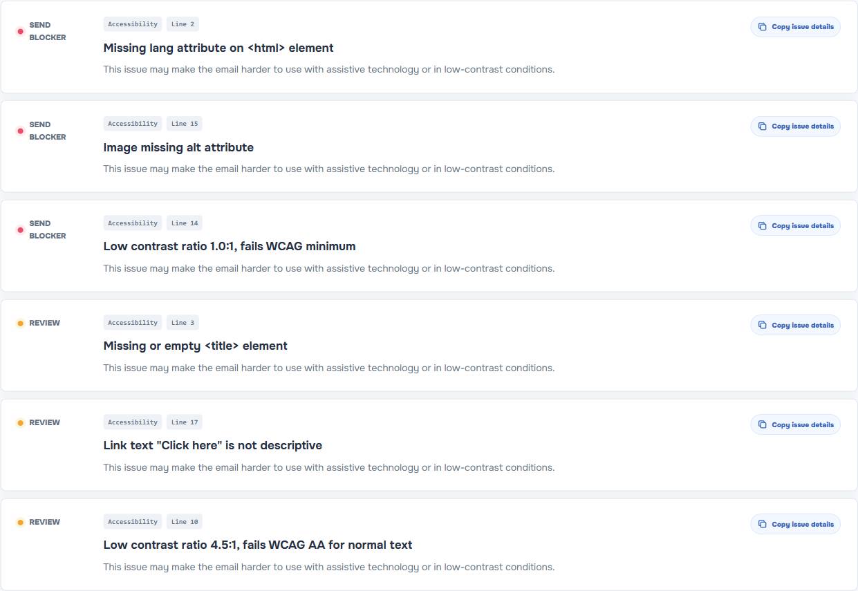
EasyAImail Email HTML Preflight checks contrast after client color transformations as one static risk signal. It also checks related content issues such as missing image alt text, placeholder links, unresolved template variables, overflow, and client compatibility risks.
Static checking is not a dark-mode simulator
Do not confuse a useful warning with a claim of complete simulation. The checker does not promise to recreate every inbox, operating system, account setting, or future client update. Its job is to highlight code and content that could make the message harder to read.
When the audience or the action is important, follow the report with a real test email in the clients that matter to you. The static check makes that test more focused: you know where the fragile parts are before you start guessing.
A note for generated HTML emails
If you are starting from an idea rather than an existing HTML file, use the EasyAImail web app to describe the recipient, purpose, and facts. It recommends templates, but you choose the template and review the final HTML before any send decision.
If you already have a Gmail or Outlook draft, the EasyAImail browser plugin supports a separate review path. You choose to review the draft or select a sentence for a local change, then decide whether to apply it. Neither path removes your final review.
FAQ
Can I force every email client to use my dark-mode CSS?
No. Clients can handle color changes differently. Build a readable baseline instead of treating one theme-specific rule as a universal guarantee.
Is a white logo on a transparent background always a problem?
Not always, but it is worth testing against changed backgrounds. If the logo matters to sender recognition, give it a reliable visible treatment.
Does a contrast warning mean the whole email must be redesigned?
Not necessarily. Start with the content that carries meaning: body text, important labels, primary links, and buttons. Then review whether decorative areas need adjustment.
Does the checker send a test email?
No. It performs static analysis in the browser. A real test send remains the way to check a critical inbox and device combination.
Make the email readable before making it clever
Dark mode is easier to handle when the email already communicates without fragile visual cues. Run the final HTML through the EasyAImail Email HTML Preflight, fix readability risks, and then use a real inbox test for the final confidence check.
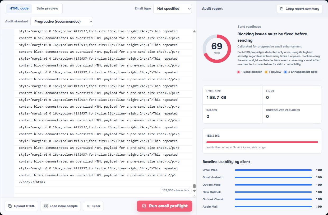
Gmail Clipping at 102 KB: What Counts Toward the Limit and How to Avoid It
Learn what counts toward Gmail's common 102 KB clipping risk, how HTML email source grows, and practical ways to reduce it without breaking the layout.
Read more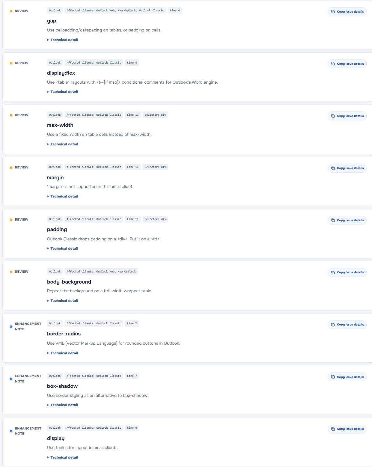
Outlook HTML Email CSS Support: What to Replace When Your Layout Breaks
See why HTML email layouts can break in Outlook, which CSS patterns carry risk, and what to replace before you send a message.
Read moreHTML Email Accessibility Checklist: Alt Text, Contrast, Links, and Variables
Use this HTML email accessibility checklist to improve alt text, link wording, contrast, and unresolved variables before you send.
Read more