
An email can be technically delivered and still be difficult to use. A missing image description can remove the only explanation of an offer. A low-contrast date can disappear into the background. A button called "Click here" can mean nothing when a reader hears the links out of context.
Accessibility is not a separate polish pass for a perfect campaign. It is part of making sure the intended recipient can understand the message you decided to send.
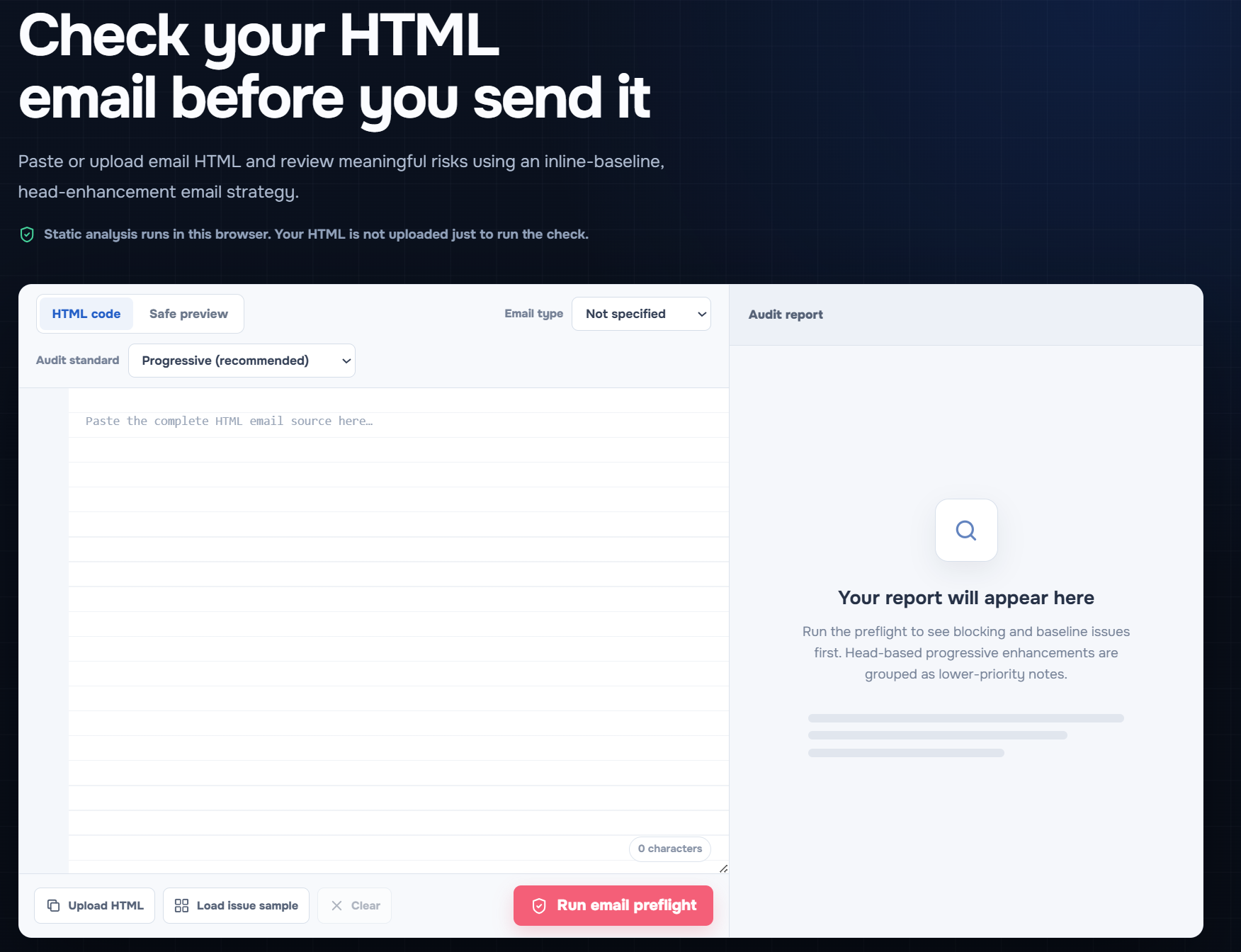
Open the free EasyAImail Email HTML Preflight to paste or upload your final HTML and review the report in your browser.
Start with the information that cannot be lost
Before fixing a single style rule, identify what the recipient must be able to understand:
- Who the email is from.
- What changed, is due, or needs attention.
- What action to take next.
- Where that action leads.
- Any deadline, price, account, or order detail that changes the decision.
Put those facts in real text where possible. An image can reinforce the message, but it should not be the only place a recipient can find the key instruction.
Give images the right kind of alt text
Alt text is not a caption contest. It should communicate the purpose of an image when that purpose matters.
If an image shows a product with a specific offer, describe the offer or make sure the same information appears in nearby text. If an image is a meaningful button, make its destination or action clear. If an image is only a decorative flourish, use an empty alt="" so it does not interrupt the reading experience with irrelevant words.
The checker flags missing image alt text because it is often impossible to know from code alone whether the image was essential. That flag is a prompt to make the deliberate decision, not to write "image" into every attribute.
Make links understandable on their own
Avoid generic labels such as "Click here," "Learn more," or a bare URL when the context might be lost. A better link tells the recipient where it goes or what it does:
- "Review the revised proposal"
- "Download the November invoice"
- "Choose a delivery date"
Clear link text helps people scanning visually, people using assistive technology, and anyone returning to the message later. It also makes the email less likely to sound automated or evasive.
Check contrast where the decision happens
Contrast is not only about headline text. Check small labels, due dates, buttons, footer instructions, and any colored status message. The report's low-contrast warning matters most where a reader could miss a required action or misunderstand the state of an order, project, or account.
Do not depend on color alone to communicate approval, urgency, success, or error. Pair the color with written status and a clear next step. This also makes the message sturdier when an inbox changes colors in dark mode.
Catch variables before they become recipient-facing text
An unresolved variable such as {{first_name}} looks like a minor template mistake until it lands in a greeting. Then the recipient sees the machinery instead of the relationship.
The checker treats an unresolved Handlebars or Mustache variable in text content as a send blocker. Review variables, placeholders, personal names, prices, dates, and any conditional text in the final source. A beautiful layout cannot make an unfinished fact feel personal.
Do not let layout hide the message
Long unbroken URLs, oversized images, or a fixed-width section can make an email painful to read on a small screen. The checker includes overflow and image-dimension checks because the structural failure can be just as damaging as a missing word.
Use readable line lengths, meaningful headings, and a content order that still works when columns collapse. If a table is used for layout, keep the reading order logical. A layout table should help the structure stay intact, not make the content incomprehensible when styles are reduced.
A practical pre-send accessibility checklist
Run this short review after the HTML is generated or edited:
- The essential message and action appear in real text, not only inside an image.
- Every meaningful image has useful alt text; decorative images use empty alt text.
- Links and buttons explain the action or destination without relying on surrounding color.
- Important text, dates, and buttons remain readable with sufficient contrast.
- Names, dates, prices, and template variables are resolved in the final output.
- The layout does not require a wide screen, a background image, or a hover effect to make sense.
What EasyAImail checks, and what it leaves to you
EasyAImail Email HTML Preflight brings missing alt text, low contrast, placeholder links, unresolved variables, image issues, overflow, and client compatibility risks into one browser-local report. It is useful for finding things a rushed final read can miss.
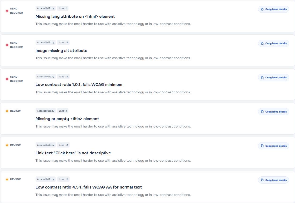
It cannot know whether your particular date is politically sensitive, whether a product description is accurate, or whether a phrase is right for a long-term client. That is why the final review stays with you.
For a message you have not written yet, EasyAImail's web app begins with your intent. It recommends relevant templates, you select one, and the conversation asks for the missing details before presenting an HTML email to review. For an existing Gmail or Outlook draft, the browser plugin offers a separate user-triggered review path.
FAQ
Should every email image have alt text?
Every meaningful image should have alt text that communicates its purpose. Decorative images generally should use empty alt text so they are skipped rather than announced as noise.
Is "Click here" acceptable for a button?
It is usually weaker than a label that states the action or destination. Describe what the recipient will do, such as "Review your account details" or "Download the guide."
Why does an unresolved variable matter if the rest of the email is correct?
It breaks trust at the moment the recipient reads it. A literal {{first_name}} tells the recipient the email was not fully checked, even when the layout looks polished.
Can an accessibility checker decide whether my tone is right?
No. Static checks can catch structural and content risks. You still need to judge whether the facts, relationship, and request sound right for the person receiving the email.
Accessibility is a final-read discipline
Run the final HTML through the EasyAImail Email HTML Preflight, but do not treat a score as a substitute for judgment. The aim is simple: every recipient should be able to understand what you are saying and what you are asking them to do.
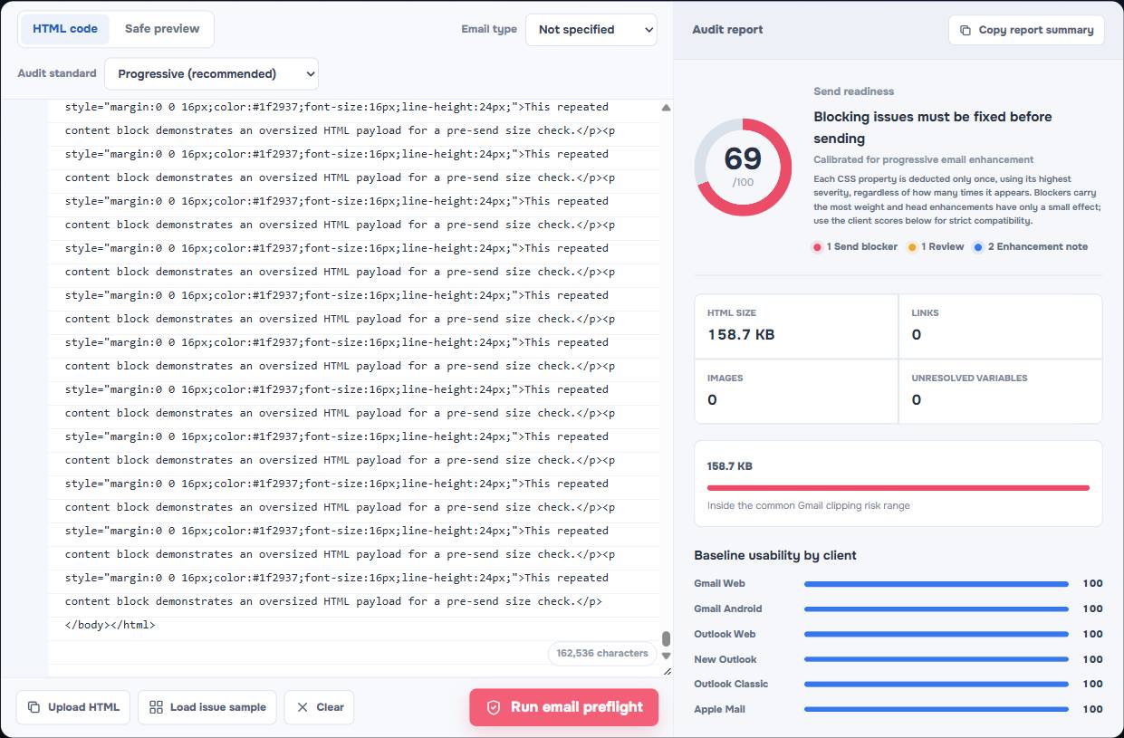
Gmail Clipping at 102 KB: What Counts Toward the Limit and How to Avoid It
Learn what counts toward Gmail's common 102 KB clipping risk, how HTML email source grows, and practical ways to reduce it without breaking the layout.
Read more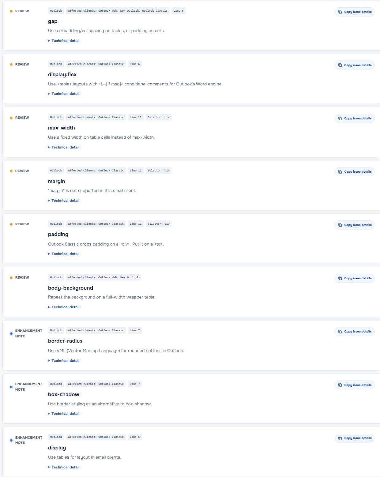
Outlook HTML Email CSS Support: What to Replace When Your Layout Breaks
See why HTML email layouts can break in Outlook, which CSS patterns carry risk, and what to replace before you send a message.
Read moreEmail Dark Mode Testing: What to Check Before You Send
A practical email dark mode testing guide for Gmail, Outlook, and other inboxes: contrast risks, color changes, and pre-send checks.
Read more