
The hard part of email dark mode is not simply that colors change. It is that a recipient may lose the one thing that tells them what to do: a visible button, a readable deadline, a recognizable logo, or a status label that no longer makes sense without its color.
The right way to prepare for Gmail and Outlook dark mode is to build an email that remains understandable when a client changes part of its presentation. Do not try to force identical pixels everywhere. Protect the text, the action, and the hierarchy that the recipient needs.
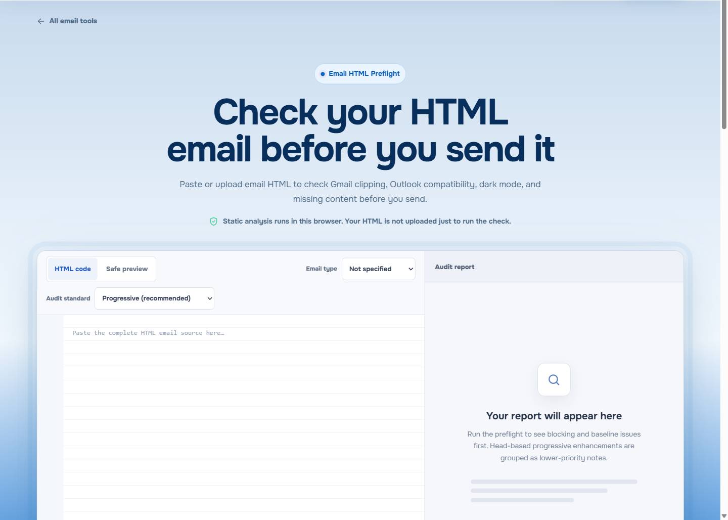
Open EasyAImail Email HTML Preflight to review dark-mode-related readability risks in the final HTML before a focused inbox test.
Gmail and Outlook are different test targets
Gmail and Outlook do not form one shared dark-mode environment. They can differ by product, platform, account setting, and future update, so a result in one view is not a permanent rule for another.
That does not make testing pointless. It changes the question. Instead of asking, "How do I make every theme look exactly the same?", ask, "What must remain legible and actionable if the client changes colors or ignores an enhancement?"
For the wider testing process, see HTML Email Accessibility Checklist. Dark mode is closely tied to the same practical questions: contrast, link meaning, text alternatives, and whether information exists outside a decorative image.
Protect three things before the visual finish
Text that carries a decision
Dates, account states, price changes, and next steps should appear in real text with enough contrast. Do not place the only explanation inside a pale badge or an image whose background can change.
A primary action that still looks like an action
A button needs a clear label and enough separation from its surroundings. "Review the revised proposal" still communicates a next step if an inbox flattens the border radius. "Click here" does not gain meaning from a color treatment.
Sender recognition that does not disappear
A white logo on a transparent background can become difficult to see against a changed surface. If the mark is important, give it a stable treatment or make sure the sender is also evident in text nearby.
Do not make color do all the explaining
Color can reinforce a status, but it should not be the only way the email says "approved," "action needed," or "deadline moved." Pair color with a written label and a specific sentence about what happened.
This helps in dark mode, on a low-quality display, and for readers who do not interpret color in the same way. It also makes the email sound more direct: the recipient should not need to decode a red or green shape to understand what you are asking.
Build a stable baseline before theme-specific rules
Theme-aware CSS can be useful, but it is an enhancement. The baseline should stand without it:
- Use clear foreground and background contrast around essential text.
- Keep important details out of background images.
- Make the primary link or button label specific.
- Give meaningful images useful alternatives and leave decorative images quiet.
- Use structure and wording, not color alone, to separate urgency from ordinary information.
If the layout also depends on fragile CSS, dark mode can expose the weakness. Outlook HTML Email CSS Support is a useful companion when the content container, spacing, or action may already be at risk in Outlook.
Use a static report for the risks it can see
The visible report listed image alt, contrast, and link-text risks together. Those findings are related: a transformed color can reduce contrast, an image may carry information that needs a text alternative, and a vague link becomes harder to use when its visual treatment weakens.
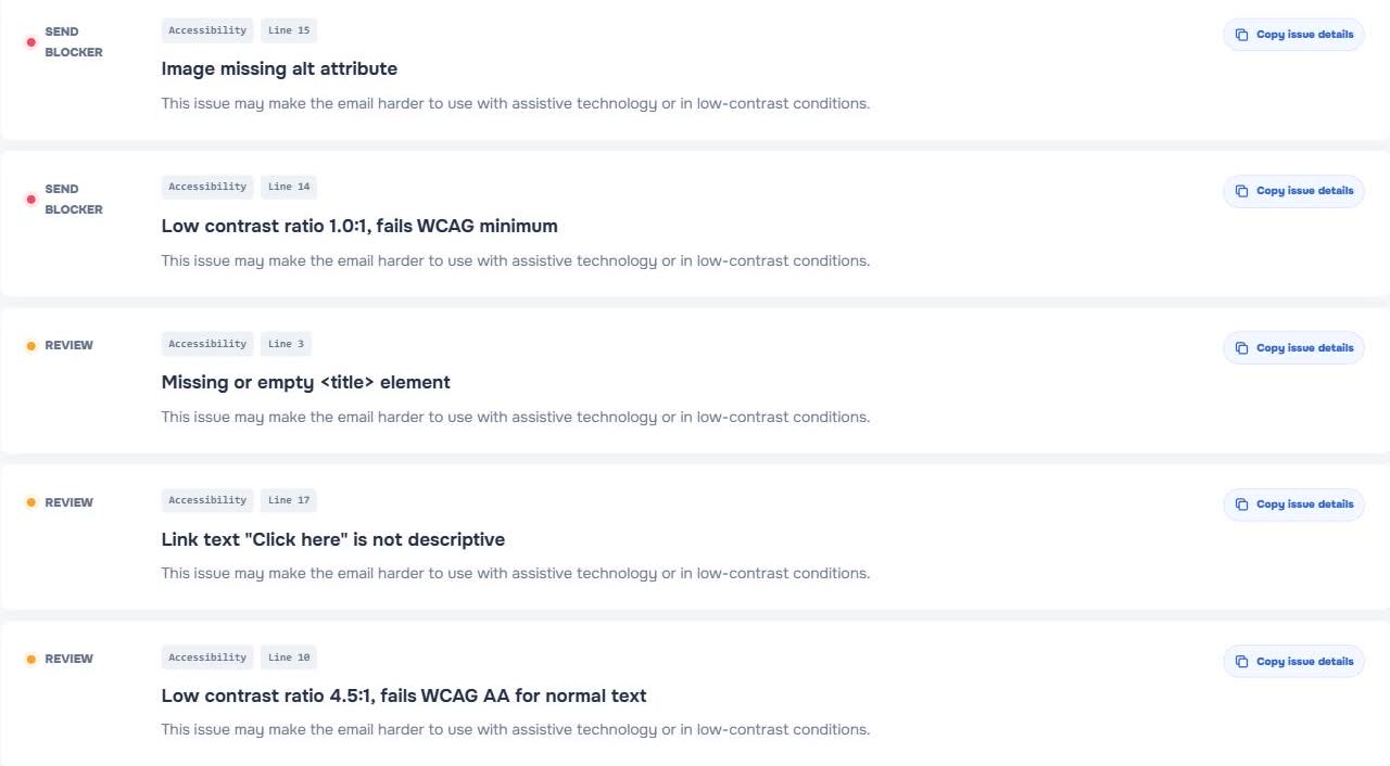
EasyAImail Email HTML Preflight looks at supplied HTML in the browser and highlights static risk signals. It can make a dark-mode review less vague by drawing attention to content that is already fragile.
Static checking is not an inbox simulator
The checker does not emulate every Gmail or Outlook theme, device, account setting, or future version. It cannot guarantee a pixel-perfect result or predict what one individual recipient will see.
Use it to decide what deserves a live test. If an email carries a deadline, account change, payment instruction, or customer action, send a representative test to the client mix you care about after the static issues are addressed.
Review a real email, not only a component
A color pair may look fine in isolation while the completed email still fails. Check the full message for a logo that sits on a new surface, a footer that becomes faint, a status line that relies on color, and a button competing with several decorative boxes.
Read the email once as a recipient who is in a hurry. Can they identify the sender, understand the situation, and take the one intended action without guessing? That is a stronger success condition than preserving every visual nuance.
Where EasyAImail fits before and after HTML exists
When the difficult part is composing an important message, the EasyAImail web app starts with the recipient, purpose, and facts. AI recommends templates; the user selects one, supplies missing details, reviews the HTML, and decides what happens next.
When the HTML already exists, Email HTML Preflight is the technical check. For a draft already open in Gmail or Outlook, the EasyAImail browser plugin offers a separate user-triggered review path. In all three cases, the recipient facts and send decision remain with the user.
FAQ
Can I force Gmail and Outlook to use the same dark-mode colors?
Do not rely on that outcome. Clients can alter or ignore parts of a theme-specific treatment. Build a clear baseline first, then test the client views that matter.
Is a white logo on a transparent background always wrong?
Not always, but it is worth reviewing against changed backgrounds. If recognition matters, provide a more reliable background treatment or nearby text identification.
Does a contrast warning mean I must redesign the whole email?
No. Begin with the text, label, link, or button that carries meaning. Decorative areas can be reviewed after essential content remains readable.
Does the checker send a test email to Gmail and Outlook?
No. It performs browser-local static analysis of the HTML you provide. A real test send is still needed for a critical inbox and device combination.
Make dark mode a readability check
Make the final call based on whether the recipient can read and act. Preserve meaningful text, a clear action, and recognizable sender information before worrying about subtle visual polish, then test the final email where it will actually be read.
 Get the Edge extension
 Get the Firefox extension